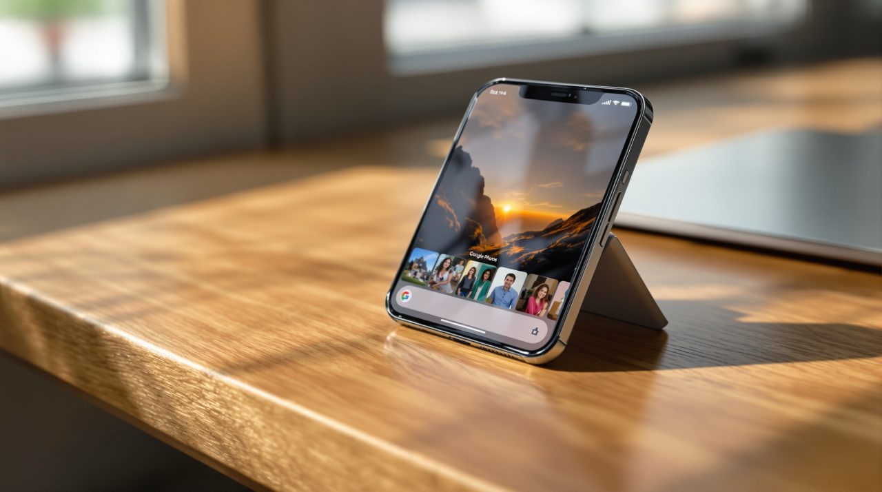
Google just gave two of its most used iPhone apps a design update that borrows directly from Apple’s own playbook. Google Photos and Google Health are rolling out Liquid Glass, the translucent interface style Apple introduced with iOS 26 a year ago, layered on top of Google’s own Material 3 Expressive look.
If you have opened Google Photos on an iPhone recently and noticed the bottom toolbar suddenly letting background content show through, that is not a glitch. It is Google matching the visual language iPhone owners have lived with since last September, and it is arriving through a routine app update rather than any announcement.
TL;DR: Google Photos version 7.94 and the Google Health app are picking up Liquid Glass, Apple’s frosted, translucent interface style, on iPhone. The bottom navigation bars in both apps now let background content show through, with a clearer transparency option in Photos. Docs, Sheets, Slides, and Keep have not been converted yet. The change was spotted by 9to5Google, not announced by Google.
What Liquid Glass changes in Google Photos and Google Health
Google Photos 7.94 replaces the solid background behind its floating bottom bar with Liquid Glass. According to 9to5Google’s Abner Li, who documented the change, two transparency levels are available: a default tint and a “More clear” option that lets more of the photo grid show through.
The top bar buttons picked up the same frosted treatment. Switch to dark theme and the active tab gets a soft blue tint instead of a plain highlight color.
Google Health’s update follows the same pattern. Its bottom navigation bar and the floating Ask Coach button now use the same glassy material instead of a flat surface sitting on top of your health data.
Why Google is borrowing Apple’s own look
Google is picking up Liquid Glass because an app that still looks like an Android port stands out on an iPhone for the wrong reasons. Apple’s version landed with iOS 26 in September 2025 as its biggest interface overhaul in over a decade, and Google’s Material 3 Expressive redesign has been spreading across its own Android and iOS apps since late 2025.
That is the part most coverage of small UI tweaks like this one tends to skip. The same pattern shows up in how Android 17 and iOS 27 have converged this year on shared ideas, from privacy defaults to AI features, even as the two platforms keep their own identities.
Gmail’s iPhone app went through its own Material 3 redesign in stages during 2025, long before Liquid Glass existed. Photos and Health are simply the latest apps pulled into a slower, ongoing project of making Google’s software feel built for whichever phone it runs on, not ported over from Android with the edges left rough.
The apps still stuck on the old look
Not every Google app has made the jump. Docs, Sheets, Slides, and Keep are still running the older Material Theme design on iPhone, while Tasks was converted relatively recently.
| App | Status on iPhone |
|---|---|
| Google Photos | Liquid Glass added (version 7.94) |
| Google Health | Liquid Glass added |
| Google Tasks | Material 3 Expressive, converted recently |
| Docs, Sheets, Slides, Keep | Still on older Material Theme design |
Google has also not said anything about bringing Dynamic Color, the system that tints Android apps to match your wallpaper, to iPhone. Apple’s platform does not give any app, including the growing list of AI assistants on iPhone, the same access to wallpaper data that Android grants, which is likely why Google’s apps stick to fixed accent colors there instead.
What this means the next time a Google app updates on your iPhone
Nothing about this requires you to change a setting. The rollout is tied to the app version, so Google Photos and Google Health will pick up the new look as they update in the background over the coming days.
The apps that have not moved yet are the ones worth watching. If Docs, Sheets, Slides, and Keep follow the same path, it suggests Google is working through its iPhone lineup one app at a time rather than pushing a single coordinated redesign.
For now, the gap between a Google app that feels native to the iPhone and one that still feels imported is smaller than it was last week, even if most people using Google Photos will not consciously register why the app suddenly looks a little different.